10 Most Famous Abstract Paintings That Changed the World Art
Abstract art has profoundly shaped the trajectory of modern art, especially breaking away from traditional representational forms. Rather than depicting the physical world, abstract artists use shapes, colors, lines, and textures to convey meaning, emotion, and deeper philosophical ideas.
Over the past century, abstract painting has produced some of the most iconic and influential works in art history, each contributing to the movement uniquely. In this article, we’ll explore ten of the most famous abstract paintings. Let's immerse ourselves in this colorful world.
Composition in Red, Yellow, Blue and Black - Piet Mondrian

Piet Mondrian was a Dutch painter renowned for his abstract works characterized by their geometric shapes, primary colors, and black lines. Composition in Red, Yellow, Blue and Black, one of his most famous pieces, was created in 1921.
This painting achieves balance and harmony by reducing forms to their most basic elements.
In Composition in Red, Yellow, Blue and Black, Mondrian arranges a grid of black lines intersecting at right angles, dividing the canvas into rectangular blocks of color and white space. The interplay between the vibrant primary colors and the empty spaces reflects his desire to express a sense of purity and universal order.
The black lines act as a structural framework, providing clarity and stability, while the colors - yellow, red, and blue - are placed asymmetrically, creating dynamic tension within the balanced grid.
This painting, like many of Mondrian’s works, had a profound impact on modern art and design, influencing architecture, graphic design, and even fashion. Mondrian’s legacy lies in his ability to strip art down to its essentials while still evoking a sense of vitality and depth through the interplay of color, form, and structure.
Untitled (Yellow, Red and Blue) - Mark Rothko
 - mark rothko")
Untitled (Yellow, Red and Blue) with three large rectangles of color that appear to blend and merge. The top rectangle is a deep blue, the middle rectangle is a vibrant red, and the bottom rectangle is a soft yellow. The edges of the rectangles are slightly blurred, creating a sense of depth and mystery.
Colors create deep emotional responses. Mark Rothko believed that color could communicate complex human emotions - such as joy, sorrow, or contemplation - without representational forms. The dark blue conveys a sense of melancholy or depth, while the red and yellow introduce warmth and intensity.
Rothko often said that his paintings were meant to be meditative, providing a space for introspection. He wanted viewers to stand close to the large canvases, so they could be enveloped by the color fields and have a more immersive experience. With a very large size - 73.8 x 61 inches, Untitled (Yellow, Red and Blue) easily makes viewers overwhelmed and completely immersive the effect of the work.
Rothko stripped away all unnecessary details, leaving only the essential: color. The subtle variations in tone and hue within each color block reveal the artist’s meticulous attention to the texture and layering of paint, adding depth to what might initially seem like a flat surface.
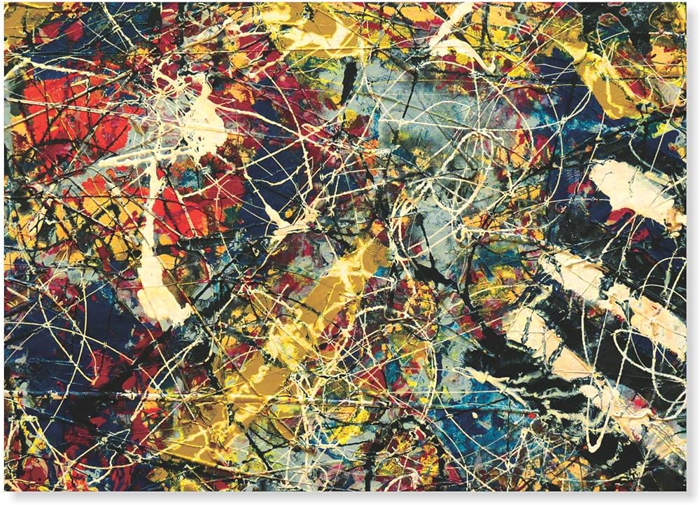
No. 5, 1948 - Jackson Pollock

Among the countless unique abstract paintings of profound influence, No. 5, 1948 has a special place. This painting brings a groundbreaking step with bold, energetic brushstrokes with its complex web of colors and textures.
No. 5, 1948 is dominated by shades of brown, black, and white, with occasional hints of other colors. The dark tones create a sense of depth and mystery, while the lighter hues add a touch of brightness and energy.
At first glance, the composition is seemingly chaotic, with no discernible subject or focal point. However, the painting is carefully balanced and composed, with the lines and colors creating a sense of movement and rhythm.
The strange composition of No. 5, 1948 has power due to the overwhelming sense of chaos and movement. So, this painting draws the viewer into its frenetic energy.
This painting also represents a turning point in Pollock's career, as his innovative techniques began to receive widespread recognition.
No.6 (Violet, Green and Red) - Mark Rothko
 - mark rothko")
Mark Rothko is an artist who is mentioned twice in this article. But there is an interesting fact that Rothko used to reject being labeled as an abstract painter, arguing that his work was not about form but about creating an experience.
No. 6 (Violet, Green and Red) is another iconic color field painting by this American artist. Created in 1954, this work is known for its large-scale format, soft, blended colors, and emotional impact.
Like many of Rothko's other works, No. 6 (Violet, Green and Red) is very large, measuring 94 inches by 57 inches for the aim of creating the overwhelming and immersive effect of the painting.
The painting is composed of three main blocks of color: violet at the top, green in the middle, and red at the bottom. These colors are applied in soft, almost translucent layers, and their edges are blurred for the colors to gently fade into one another. Rothko’s use of color was intuitive and emotional, meant to evoke deep, personal reactions from the viewer.
The dark, almost somber violet contrasts with the vibrant red, while the green acts as a neutral middle ground. This juxtaposition of colors creates tension and balance that can evoke feelings ranging from melancholy to warmth.
This painting is entirely abstract, without any representational imagery. Rothko’s goal was to strip away any specific references to the outside world, allowing the viewer to focus solely on the emotional impact of the color and form. He believed that his paintings could communicate directly to the viewer’s soul, bypassing the intellect and speaking to more primal, emotional states.
Interchange - Willem de Kooning

Interchange is a groundbreaking abstract expressionist oil painting on canvas created in 1955 by the Dutch-American painter Willem de Kooning. This iconic work is renowned for its bold, energetic brushstrokes, its complex web of colors and textures with enigmatic subject matter.
De Kooning used thick, impasto brushstrokes to create a sense of energy and movement. The paint is applied in a seemingly chaotic manner, yet there is an underlying sense of balance and composition.
The painting is dominated by warm tones of orange, pink, and yellow, contrasted with cooler blues and greens. De Kooning applied paint in layers and then scraped away portions to reveal underlying colors.
While the painting is abstract, there are hints of figurative elements, particularly in the central section, which some viewers have interpreted as a woman's figure. However, the meaning of the painting is open to interpretation, and there is no definitive answer as to what de Kooning intended to convey.
In 2015, the painting made headlines when it was sold for $300 million in a private sale, making it one of the most expensive artworks ever sold at that time.
Number 17A - Jackson Pollock
Jackson Pollock revolutionized the world of modern art with his unique approach to painting - dripping, flinging, and pouring paint onto a horizontal canvas. Number 17A is a vivid demonstration of this method. To create this work, Pollock translated dynamic, spontaneous movements into energetic lines and splatters.
The depth of 17A comes from the way the layers of paint interact instead of the traditional sense of perspective. Number 17A uses a vibrant mix of colors, with splashes of yellow, red, blue, and green playing off the darker tones of black and white. The combination of bright hues and stark contrasts enhances the painting’s sense of movement and depth. Number 17A bursts with color, adding to its emotional intensity.
Like most of Pollock’s work, 17A is entirely abstract and non-representational. There are no recognizable figures or objects, and instead, the focus is on the interplay of line, color, and texture.
The chaotic, dynamic forms can evoke a wide range of feelings in viewers. You can feel from excitement and vitality to anxiety and confusion. That's the interesting point hidden deep in an abstract painting.
Yellow, Red, Blue - Wassily Kandinsky

Kandinsky was a Russian painter. He has a special place in abstract painting. Throughout his life, this artist pursued the concept of turning art into its language. Yellow, Red, Blue is his most typical work.
Yellow, Red, Blue exploit the beauty of geometric shapes like circles, squares, triangles, and lines. The shapes are arranged in a way that suggests movement and dynamism. Because of this reason, when you look at the picture, you will feel the painting is not static.
The primary colors - red, yellow, and blue - each carry symbolic meaning for Kandinsky. Red is associated with strength and vitality, yellow with warmth and energy, blue with spirituality and depth.
Kandinsky was heavily influenced by music, particularly the works of composers like Arnold Schoenberg. He often compared his abstract compositions to musical compositions. The arrangement of shapes and colors in this painting can be seen as a visual "orchestra," with different elements playing off one another to create a harmonious whole.
Black Square and Red Square - Kazimir Malevich

Black Square and Red Square is a groundbreaking abstract painting by the Russian artist Kazimir Malevich. This iconic work is a prominent example of Suprematism - an art movement that emphasized the supremacy of pure geometric forms.
The painting features stark geometric shapes, most prominently a large black rectangle and a red rectangle against a white background. Why is there such a minimalist work? Because Malevich believed that the essence of art could be reduced to basic geometric forms, free from the constraints.
The rectangles ingeniously aligned at slight angles, appear to be in motion. Besides, the stark contrast between the black, red, and white shapes creates a sense of tension and balance. So, when immersed in the painting's beauty, you get feelings that go beyond the visual.
Malevich was not interested in creating an illusion of three-dimensionality but rather in exploring the abstract relationships between shapes in a flat, two-dimensional plane. One highlight in the painting is the slight tilt of the rectangles adds to the painting’s sense of dynamic instability - a feeling of weightlessness or suspension is stirred.
Number 1 (Lavender Mist) - Jackson Pollock
 - jackson pollock")
Once again, we mention the talented artist who has left many strong marks in abstract art - Jackson Pollock. Because we cannot ignore his outstanding work - Number 1 (Lavender Mist). It remains one of the most celebrated and analyzed paintings in the history of modern art.
Despite its title, Lavender Mist does not feature obvious lavender hues. Instead, the painting is composed of a complex mix of whites, blacks, grays, and subtle hints of blue, pink, and yellow. When viewed from a distance, you can see an overall lavender-toned effect.
The painting is dominated by shades of brown, black, and white, with occasional hints of other colors. The dark tones create a sense of depth and mystery, while the lighter hues add a touch of brightness and energy.
To create this big painting, Pollock applied paint by dripping or flinging it onto the canvas from above. He engages with the canvas from all sides, moving around it. His physical gestures are recorded in the dense, web-like layers of paint that cover the surface. The painting reflects the immediacy of Pollock's movements, capturing a moment of artistic performance.
Some art critics have described the painting as evoking feelings of energy, tension, and even anxiety. Others interpret it as a reflection of Pollock’s search for order and meaning within chaos.
Black Square - Kazimir Malevich

"Black Square" by Kazimir Malevich holds a position as the most iconic and revolutionary work in the history of modern art.
"Black Square" was first exhibited in 1915 at "The Last Futurist Exhibition 0.10" in St. Petersburg (then Petrograd). It was placed in the corner of the room, a position traditionally reserved for religious icons in Russian Orthodox households. We can understand the artist wants to suggest its importance and almost sacred status.
The painting is a simple black square on a white background. This radical simplicity was unprecedented at the time and was a bold statement about the potential of abstract art.
For Malevich, "Black Square" was not just a painting but a symbol of a new artistic language. He believed it marked a break with the past and with representational art.
The black square itself was intended to represent "pure feeling". Malevich saw the painting as the "zero point of painting," a starting point for the future of art. A profound philosophy is revealed that art no longer had to mimic reality but could exist for its own sake.
The painting arrived at a time of great political, social, and technological change in Russia, and it reflected the avant-garde’s desire to break away from the past and invent new ways of seeing and thinking about the world.
"Black Square" has been interpreted in many ways. You can see it as a symbol of nihilism, a challenge to the bourgeois art world, or simply view it as a meditative piece that opens up the possibility for endless interpretations.
Explore additional courses with Skilltrans to deepen your understanding. Please click on the course name below to learn more:
Painting in the loose style with watercolors is easily one of my favorite things to do. Learn how to use simple brushstrokes to create six different flowers: lavender, lilac, hibiscus, cherry blossom, calla lily, and magnolias. So get ready to let loose with your brush and apply lots of creative freedom to your paintings.
Drawing and Colouring: Birds and Flowers (Art as Meditation)
Nature influences art in many we can't imagine art without nature. As it is the source of inspiration for every artist, its the best way to start learning art through nature. Its a kind of meditation in which we relate ourselves with the beauty of nature. When you indulge yourself in activities related to nature you feel calm and relaxed.
In this course you will learn to make beautiful leaves, flowers and exotic and beautiful birds which will not only enhance your painting.
Character Art School: Complete Coloring and Painting
Whether you want to learn to color and paint characters for games, comics, cartoons, manga, animation and more, this course has you covered. The lecturer is not teaching you a 'method' or a 'way' to color and paint, the lecturer is teaching you to be a fundamentally good character colorist and painter.
Conclusion
Abstract art has left an indelible mark on the world of modern art, offering viewers a new way to interpret and engage with visual expression. The ten abstract paintings highlighted in this article showcase the diversity, innovation, and emotional depth that define the abstract movement.
As you explore the world of abstract art, remember that there is no one-size-fits-all interpretation. The beauty of abstract art lies in its open-ended nature, inviting viewers to find their own meaning and connections within the works.
The world of art is always new and diverse. To learn more about this world, you can register for Skilltrans courses today. We have many diverse courses waiting for you.

Meet Hoang Duyen, an experienced SEO Specialist with a proven track record in driving organic growth and boosting online visibility. She has honed her skills in keyword research, on-page optimization, and technical SEO. Her expertise lies in crafting data-driven strategies that not only improve search engine rankings but also deliver tangible results for businesses.